Streamline.
Simplify.
Elevate.
OVERVIEW
The California-based startup, is an extension of a leading real estate agency that has sold 1,200+ homes & is aimed at simplifying the home-buying journey for prospective home buyers.
MY ROLE
I worked directly with the startup founders to transform their product, by building a strategy to
define goals & taking it from zero to one by creating a shippable version in the form of an MVP
DESIGN INTERVENTION
product strategy
UX copywriting
0 -> 1
feature prioritisation
roadmap building
PROBLEM STATEMENT
Buying a home in
the United States
is difficult.
It involves various complex processes
that are fragmented over platforms.

FRAMING DIRECTIONS
How might we build a platform that will unify housing processes & bring users one - step closer to finding their dream home?
Make it memorable
Add an element of delight
Use captivating & personalised interactions for engagement.
First things first

It needs to be transparent
Product success is higher if we reduce ambiguity.
Don't overcomplicate things
Minimise the learning curve
Guide users through intuitive & simple flows for efficiency.
AUDIT THE EXISTING PRODUCT
Evaluate to find gaps
We began by analysing V1 of the product to understand workflows, touchpoints & identify the new modules needed.
Home Screen
INACCURATE VISUALS
• The visuals fail to convey the app’s purpose
• The font choice and sizing do not adhere to best practices in visual design
HARD TO ACCESS CTA'S
• The call-to-action buttons are poorly sized & difficult to access, as they are not positioned within easy reach of users’ fingers

UNCLEAR TOUCHPOINTS
• The flows and links are not easily identifiable - leading to ambiguity & confusion
CRUCIAL FEATURES MISSING
• The system lacks essential features needed for users to find a house
LACK OF METRICS
• The absence of metrics & a clear hierarchy on the cards makes the interface challenging to navigate

Dashboard
Home Preference Filters
HIGH EFFORT DATA ENTRY
• The methods of data input are not optimised & high effort
LOW USABILITY
• The system has a high rate of error frequency, which can lead to user confusion & frustration
SUBOPTIMAL UX
• The interface has features that are limited & time-consuming

Opting for a PWA
ANOTHER CHALLENGE
Identifying the right platform
In order to decipher the approach for the product platform, we considered various parameters.
We asked ourselves questions like :-
🙋🏽♀️🙋🏼♂️ Who would be using the product?
📱💻 What devices do they own?
🔎🏠 How are they currently finding homes?
👨🏽💻⏲️ What is the bandwidth of the development team?

80 % mobile users
who browse housing platforms
faster turnaround
when deploying app updates
scalability
a robust product
can be built
offline option
can work in low - network areas
Based on the findings above, we chose a PWA-first approach, a solution that met all our needs at that given time.
GATHERING INFORMATION
Putting the business & user first.
We spoke to the various stakeholders including real estate agents & the founders, not only to understand pain points - but as a way to chart out goals for the business & create a metric-oriented successful product.
⛓️💥 disjointed experience where users are opting for a combination of other apps
😔 incomplete interface that lacks features necessary for home buying
😰 overwhelming processes that are lengthy, complicated & confusing

FEATURE PRIORITISATIONS, & DISCOVERY WORKSHOPS
✔️ House Tour Booking
x
Collaboration
x
Housing Roadmap

✔️ Step - wise approach
Housing Listing
x
✔️ User Community

✔️ House Tour Booking
x
Housing Roadmap
✔️ Housing Comparison
Standing out in a market of 100+ players.
The real-estate industry in the USA currently has more than a 100 players. We hand-picked the top few competitors to understand what they offer & what they don’t - to find gaps that can turn into potential design opportunities for us. Here were some key take-aways.
So many businesses, yet none that cater to all housing needs?
Let's change that.
What users need
UX solutions
" I don't want to use so many apps for my house
search. I would like to do everything on one platform. "
" The housing process is very confusing. I want to understand it easily so I can find a house faster. "
" I feel a little lost sometimes. It would be great to have some help for when I have doubts "
" I want to control my settings as per my needs - like changing my housing preferences "
• 1 - 1 support ( a dedicated agent )
• Page tags as tutorials
• Empower users with decision-making
• Live feedback during interactions
• Step - by - step guidance
• Intuitive interfaces
• Unify functions
• Introduce crucial features
My role? To give shape to an entrepreneur's vision.
And..the market has 100+ players
And..the market has 100+ players
LEGEND
ACTION
Required
Module
ONBOARD
Sign Up / Sign In
SCHEDULE HOUSE TOURS
Booking Flow
MODIFY PERSONAL DETAILS
Profile
CONTROL KEY ACTIONS
Dashboard
CONNECT WITH PEOPLE
Messaging
SEARCH FOR HOUSES
An area map
MANAGE TASKS
Sign Up / Sign In
HIGH LEVEL INFORMATION ARCHITECTURE
Developing an archetype
After researching & defining design directions, we created an information architecture, outlining core functionalities as actions linked to UX modules. The goal was to establish a foundation before detailing each component.

Iconography
Soft, round-ish icons that are friendly & familiar
Typography
Cabin incorporates modern proportions, optical adjustments, and some elements of the geometric sans.
VISUAL DIRECTION
Colour palette
A blend of softer tones of orang-ish beige with accents of redwood - to evoke a sense of trust & stability.
SECONDARY
#FFFFF18 : 50
PRIMARY
# A84448
5 : 86
#E9A179
9 : 83
#F5E1C3
5 : 86
#0B1320
18 : 50
NEUTRAL
Cabin Regular
Elevate your home buying journey. Setup your first house tour now!
Cabin Medium
Elevate your home buying journey. Setup your first house tour now!
REAL ESTATE REDEFINED
Welcome home!

LANDING PAGE
Familiar yet new
Integrated copy that communicates what returning users & new users should expect on the new platform.

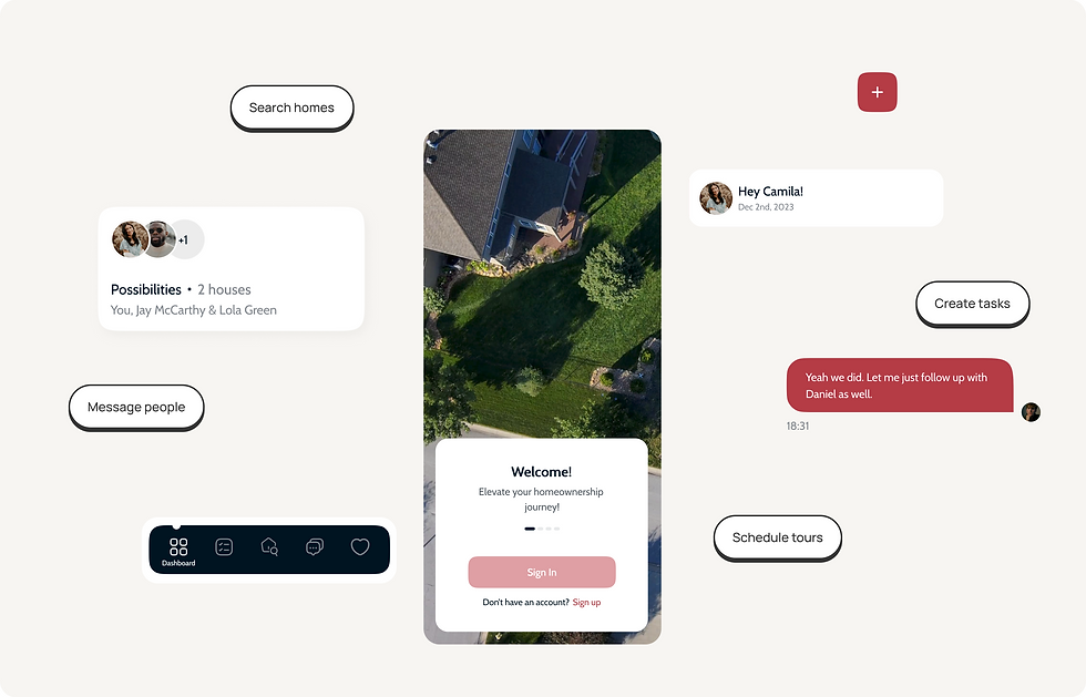
DASHBOARD
Assistance from the start
A dashboard that encourages users to explore the platform through subtle nudges.

SEARCH, NOTIFICATIONS & TASK LIST
Let's play tag!
A tag system with basic instructions was implemented across the app to help guide users & minimise the learning curve for efficiency


TAB SYSTEM : SCALABLE | FLEXIBLE | INTUITIVE
AN EVER - EVOLVING PRODUCT
How does one build at scale?
Make the product robust.
Since the product was split across various phases, & would grow over time with features & user feedback, we decided to implement a tab system a that allowed for modules to be both organised yet flexible as additions / subtractions could be made easily.
DESKTOP VERSION
Something for each stakeholder.
While prioritizing a mobile-first approach for users, we also developed a desktop version for agents & administrators who prefer their existing systems, offering more screen space & control for efficient data management.

Collaboration is key.
As a team assigned to different modules but united by a shared passion for the product, we established efficient systems that enhanced productivity & overcame challenges through collaborative tools using open communication.
4 different cities
a tight deadline
India - USA time zone
change of resources
async work style


OPEN FEEDBACK CYCLES ON FIGMA
TEAM STANDUP CALLS TO SYNC UP
OFFLINE MEETUPS & BEERS!


Wall of love.
A few words from the super - talented team I worked alongside, including my fellow design colleagues & clients.
TASKLIST ITERATIONS
Explore, design, refine
Various modules involved an iterative process where our team critically examined each idea at the wireframe stage to identify improvements in usability & user experience.
The task list was one such module. Our goal was to present data in an organized, user-friendly manner. We achieved this through multiple rounds of feedback & refinement until we found the most optimized solution.


✔️ Clean & Simple
Low impact visuals
✔️ Metrics
% system is too vague
( since no. of tasks is not fixed )
✔️ X out of Y metric
01
02
03
No Metrics
x
x
x
number of completed
tasks in a group is missing
x
✔️ Appropriate metrics
✔️ Dropdown
✔️ Colour coded groups
04

Helping our users help themselves
Utilizing ready-made lists ( which can be modified ) serves as intuitive suggestions, streamlining processes and enhancing usability
This approach not only creates a
🤩 sense of delight,
🤝 support, &
💪🏼 empowerment
but also significantly boosts likelihood of users completing processes without abandoning them.

TEMPLATE LISTS


🥜
Impact & takeaways.
In a nutshell,