Transforming healthcare for patients
EFFICIENCY • USABILITY • OPTIMISATION
RESEARCH TAKEAWAYS
But, why are patients struggling so much with the system?
😓 Multiple information gaps
The lack of essential information on the website left users feeling overwhelmed, forcing them to make multiple phone inquiries.
🙍🏽♂️⛓️💥👩🏽⚕️ Disconnected experience with doctors
Missing health reports & patient history made appointments with doctors less efficient & more time-consuming.
👩🏽💻 Unavailability to track appointments
A non-digital system without tracking led to numerous cancellations/delays & increased back-and-forth communication.
📋 L E N G T H Y contact forms
A simple registration form or contact form was unnecessarily lengthy, resulting in users abandoning it midway.
PRINCIPAL AIM
Engagement & retention:
the KPI for the business
Once we identified pain points, the redesign became our key focus. An experience that would maximize the usability of the platform is what drove our key performance indicators.
👩🏽💻
Improved login rate
Marked by the number of new users converting to patients, & reduced drop - offs amongst past users.
📞
Reduced query calls
Indicated by a lesser number of calls to the support team, who typically operate around the clock.
🗓️
Booking success rate
Shown by a difference in the % of users who have made in-person appointments on the platform
WEBSITE AUDIT
The platform failed to address basic requirements
After completing a round of insight-based research, our team conducted a website audit to examine the patient experience more closely. We identified key problem areas across various touchpoints, which served as opportunities for targeted design improvements.
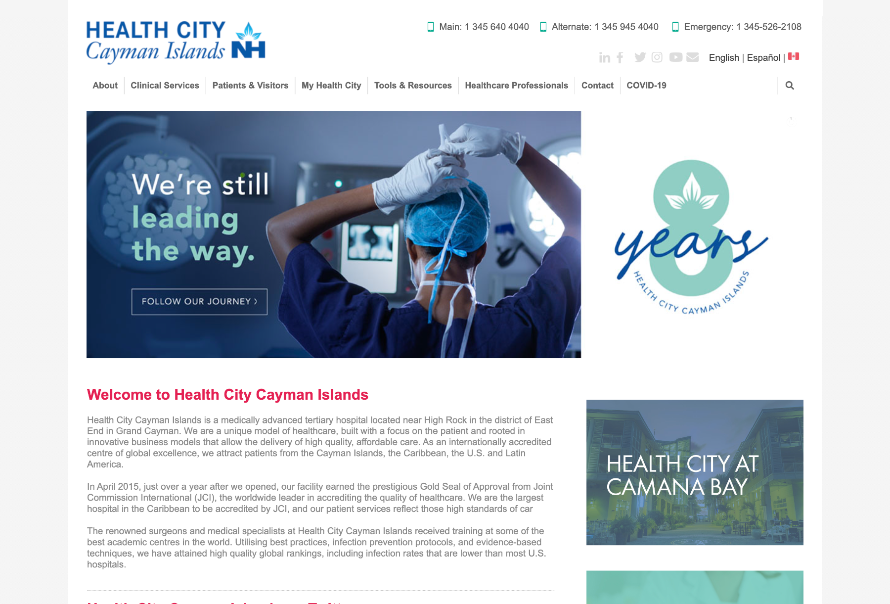
LANDING PAGE
Information Overload
Cluttered tabs which were too many in number
Missing CTA buttons leading to poor accessibility
Lack of information hierarchy
TURNING DIAGRAMS INTO SCREENS
Centralized appointments
The main goal of designing the consultation module was to create a detailed, structured chart that would allow users to manage appointments for themselves & their families. We were able to achieve this by displaying key appointment details upfront.
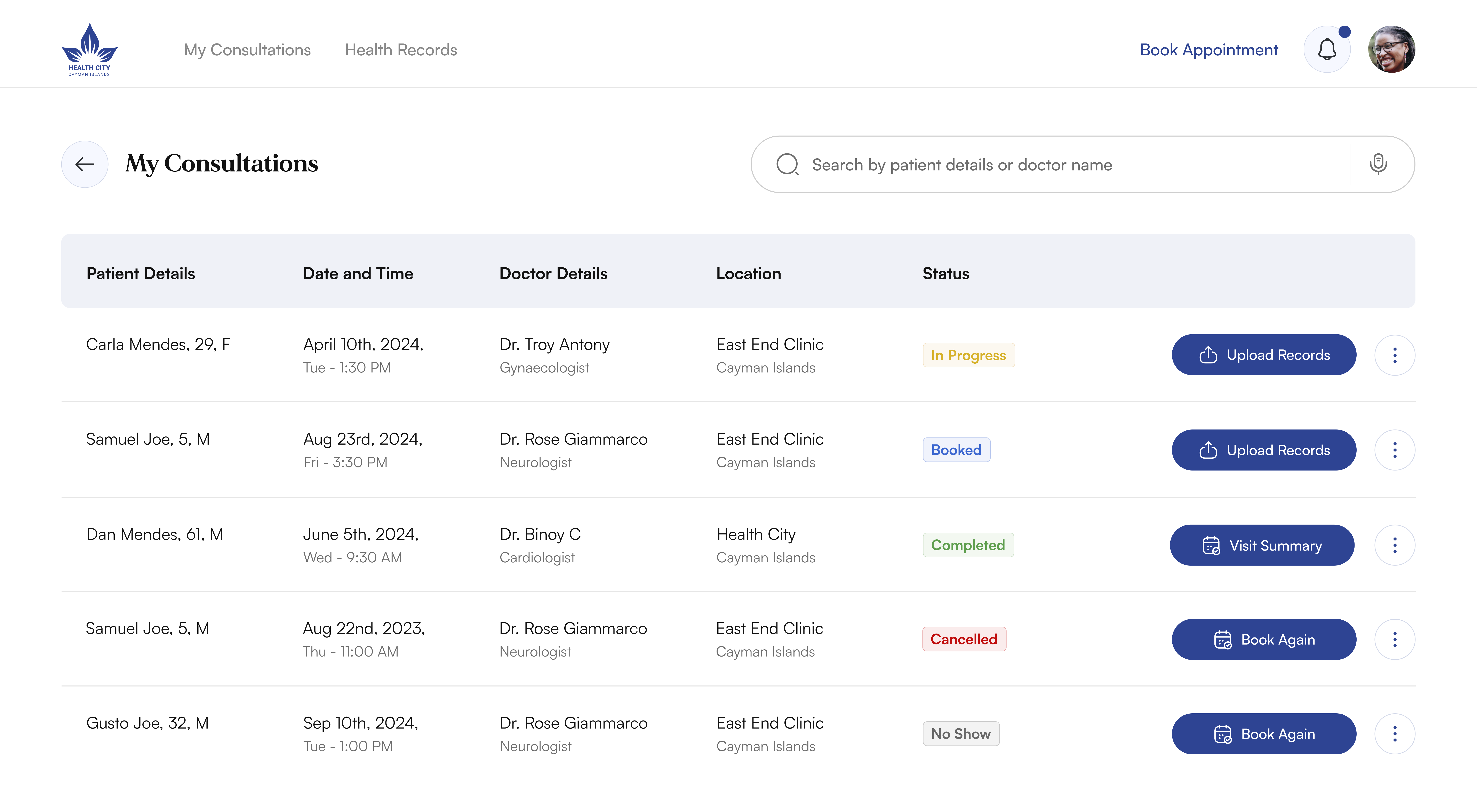
LOCATION DETAILS
To avoid accidental appointment mix-ups, since the hospital has 5+ locations
VISUAL INDICATORS
Status markers that reduce cognitive load & enhance overall clarity
CUSTOMISED CTA'S
Added as a prompt for users to follow up on appointments, based on behavior analysis to streamline actions
MULTIPLE MEMBERS
Users can track appointments for themselves
& family members both
ADDITIONAL OPTIONS
Supporting appointment options are present in a kebab menu
SEARCH BAR
Find appointments faster & with ease
HCCI 2.0 : THE REDESIGN
Making the path to quality healthcare simpler & smarter
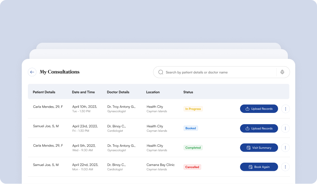
📋 Track all your appointments in one place
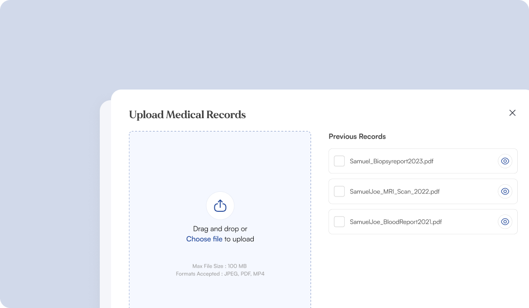
⬆️ Upload health reports ahead of time

✅ Get instant confirmations

+ Add family members
2 x
To find crucial information
1/10th
The number of clicks in the happy flow
100%
Increase in number of new patients
130+
New users on the platform
FIRST GLANCE // HOMEPAGE
A new, improved way to
help users find doctors
A simple "search-box" revolutionizes the way users find a doctor on the website. Be it by their name department, or the user's key symptoms, the system is designed to make things easy right from the start.

⚡️ Key module features oriented to meet UX goals
TIME OPTIMISATION
Advanced search feature
We maximized our design opportunities by effectively utilising the available screen space.
✨ Adding a search feature helped users save their time by reducing the number of clicks
MY ROLE
Innovating for change
I was responsible for the optimisation & enhancement of user journeys across the platform, & contributed by building new features across modules.
To drive impact & deliver maximum value, I adopted an approach to make users
feel seen,
heard and,
think " Hey, this is so useful! "
👀
👂🏼
🧠
ENGAGEMENT
Status - specific buttons
CTA buttons specific to the status of appointments were added as nudges- for a higher click-through rate & better engagement
✨ This way, users are more likely to complete flows
STATEMENT
So, how might we build & create an optimised solution that empowers patients to navigate healthcare with ease?
STEP 1 : UNDERSTANDING OUR CONSUMER BASE
Bucketing personas
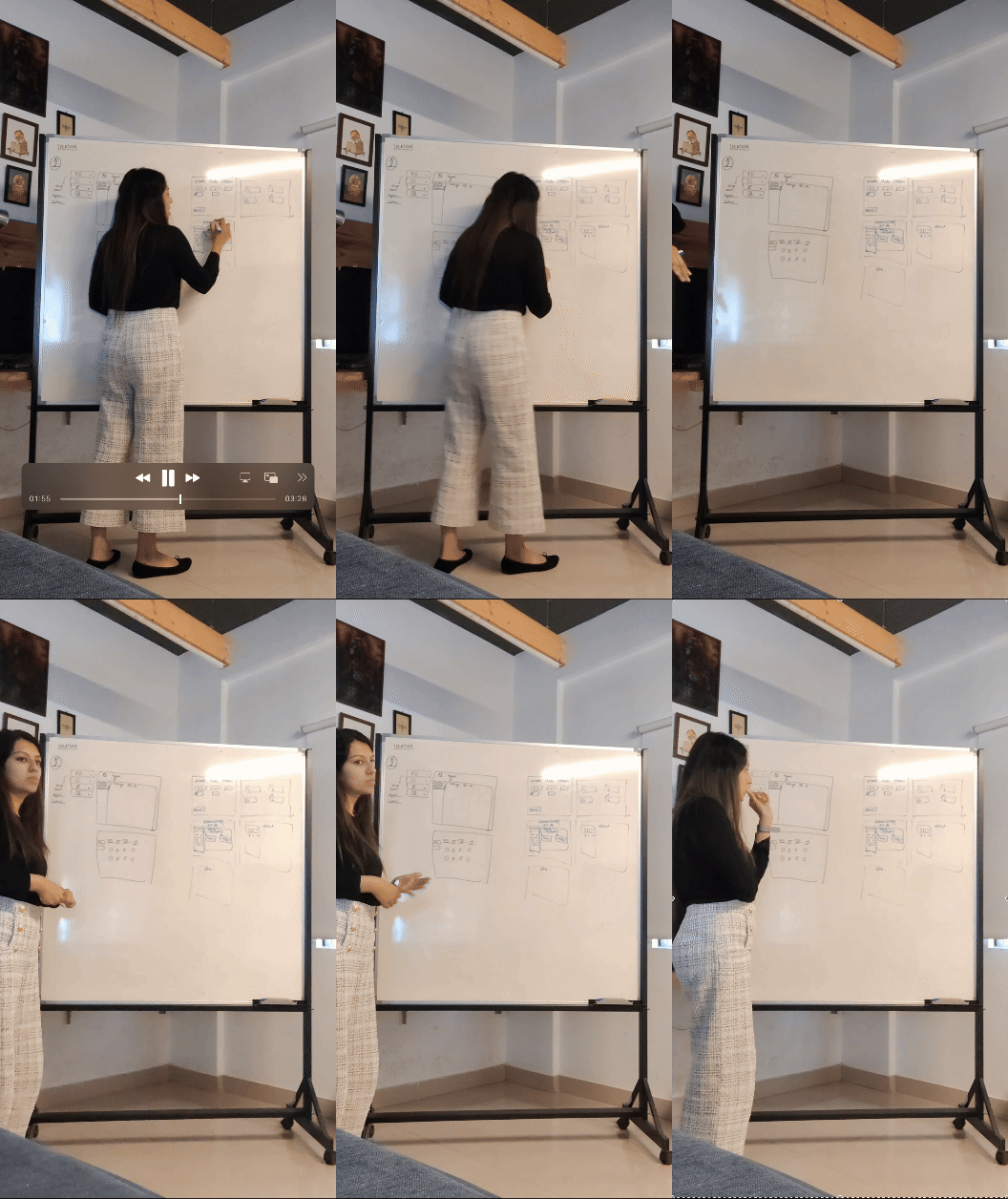
We kicked off the design process by mapping personas based on user journey touchpoints, broadly categorising them into 2 groups.

Existing patients
Those who have used hospital services in the past
• Key goal : Managing appointments
• Seek quick access to personal space
• Require reassurance

First time users
Those who are exploring the
platform for the first time
• Key goal : Booking appointments
• Seek clarity & ease of use
• Require trust - building
CUSTOMISATION
Individually designed options
We not only created custom status tags for each appointment but also designed tailored options
✨ This ensured that users have more control over their experience & can navigate flows efficiently
STEP 3 : CRAFTING AN I.A.
Building clarity though structure
Lastly, to make sense of all the data we had collected, I crafted an Information Architecture based on newer module introductions to bridge all the gaps we'd identified. This helped tie various functionalities of the product together, & laid the foundation for the wireframing.
APPOINTMENT DASHBOARD
APPOINTMENT BOOKING
REPORT MANAGEMENT
DESIGN DIRECTIONS
Craft a compelling solution
To craft a compelling solution, we zoomed in on a more specific, experience-centric aspect of the redesign.
We chose attributes that were focused around the optimisation of data & ease of use for our users.
Less is more
Simpler the interactions, smaller is the learning curve
Friendlier
Use a flow & tone that makes users feel guided in the journey
Empowering
Give users more control to make decisions
A LOOK AT THE NUANCES
The flow gets the job done. But what truly makes it valuable for the user?
The flow improved. It made the process of seeing a doctor much faster, & way simpler. But - what is it that contributed to this? Why does it work or not work?
ASSISTED NAVIGATION
Suggestions were implemented, enabling users to swiftly select files & to cut down on process time
IMMEDIATE PREVIEWS
Users have the option to view a file after uploading it - to prevent confusion, especially if the file is unnamed
GRAPHIC AIDS
Indicators that prevent ambiguity regarding the user's progress & status of actions
MICRO - ANIMATIONS
Use of micro - animations to give users real-time
feedback & an element of delight
IN A NUTSHELL
A positive impact on the
business & our users.
While we await the metrics for the redesigned product, the HCCI website redesign has already significantly enhanced user experience.
The new design direction successfully improved usability, functionality, optimization, and streamlined processes, resulting in a more intuitive and efficient platform for users.

LEARNINGS & TAKEAWAYS
It takes a village to build a product!
While we await the metrics for the redesigned product,
the HCCI website redesign has already significantly
enhanced user experience.
The new design direction
successfully
improved usability,
functionality,
optimization, and
streamlined processes,
resulting in a more intuitive & efficient platform for users
VALUE ADDITION
What impact does this new design experience have on it's users?
🙌🏼
they stay in charge.
The new design acts as control centre, empowering users with greater command over their appointments
it is user - friendly.
🫱🏼🫲🏾
The simplified interactions have minimised the learning curve & the easier the grasp
🫶🏼
trust is established.
The clarity in information creates transparency - builds trust, & allows users to make more informed decisions.

SEARCH RESULTS
All the details you need
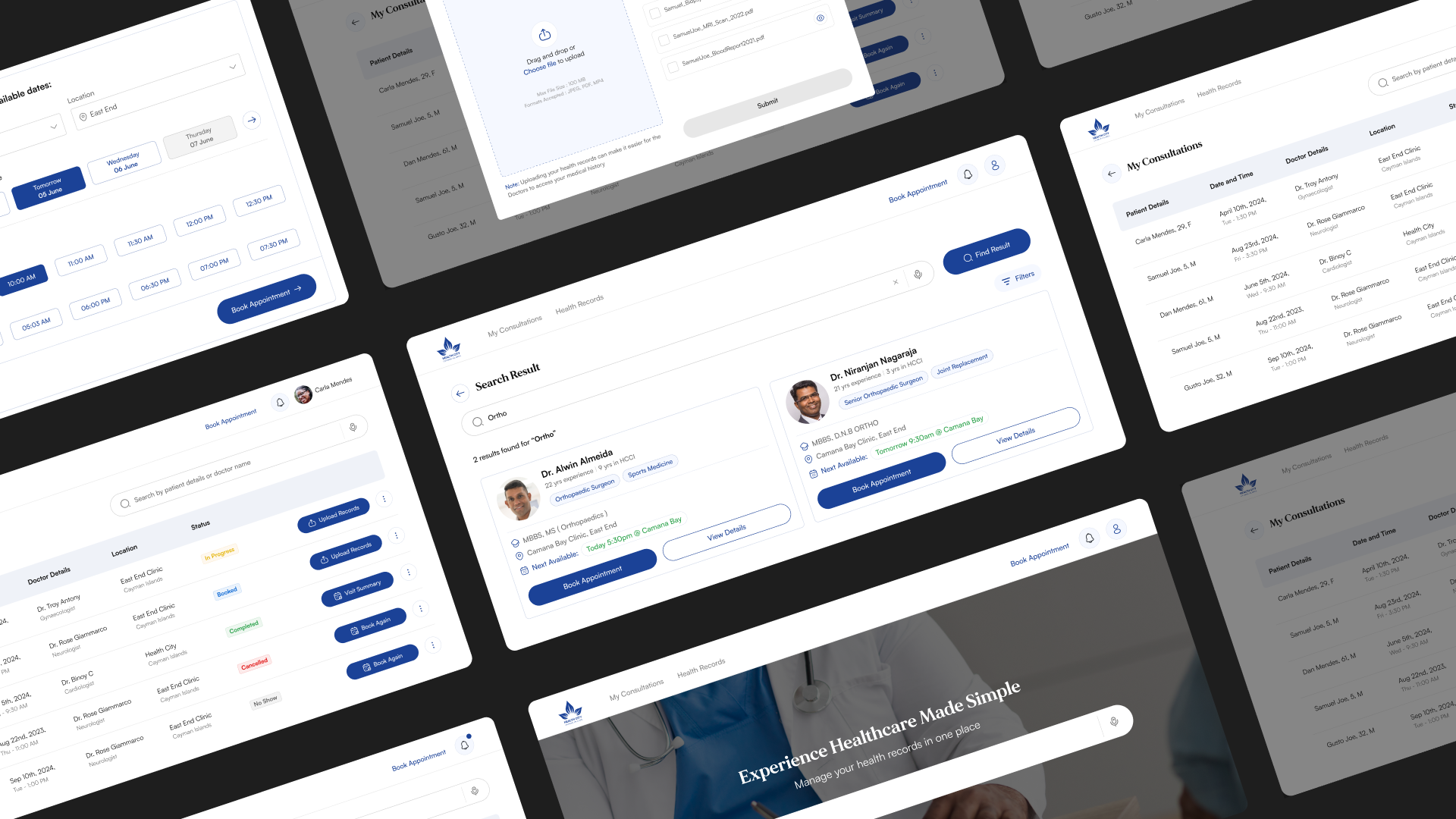
Designed to empower users with clarity, the interface highlights essential doctor information upfront. The layout encourages them to "compare" doctors & make a more informed decision.

BOOKING AN APPOINTMENT
Say hello to smarter
shceduling
A booking flow with features lets users book appointments directly with doctors, keeping doctor details at their fingertips + Live feedback ensures a smooth, delightful experience!

TRACK APPOINTMENTS
Bringing method to madness
The ultimate platform upgrade, the newly designed dashboard seamlessly unites all processes, making it a breeze for patients to manage all their appointments

UPLOADING DOCUMENTS
Make the most of each
consultation
Let's admit it, patients often forget to carry their health reports to doctor's appointments. So...we designed a feature that nudges users to share them
ahead of time for doctors to review.
Say hello to faster, improved interactions in appointments!
OVERVIEW
In 2020, the term " healthcare " found a new meaning as the global pandemic accelerated the need for remote, digital solutions.
Health City, a leading hospital in the Cayman Islands, USA faced challenges with its outdated digital platform, leaving patients disconnected from vital services.
The redesigned platform set a new standard for healthcare innovation for the company, meeting the demands of a digital-first era.
MY ROLE
Product Designer : Research Analysis, User Flows, Prototyping
I translated research insights into digital features, delivered UX enhancements that aligned with key impact goals, & ensured overall product quality.
My aim was to restructure processes & bridge the gap between doctor & patient to maximize the usability of the new platform.
TIMELINE
6 months
FOCUS
Desktop
STATUS
Live
😰
OMG! Did
I miss my
appointment?
😵💫
I am so
lost
☹️
404
Page not found
🤔
Wait, what happens next?
😟
Where is the
schedule button?
PROLOGUE
Navigating healthcare
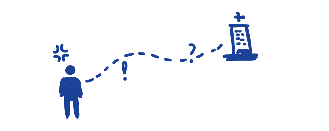
is like a maze
Discovering services & making appointments on the HCCI website has made personal healthcare confusing & complicated for patients. We spoke to 10 former patients, all of whom struggled to complete their intended tasks on the platform.
🧐
When is this
doctor available?
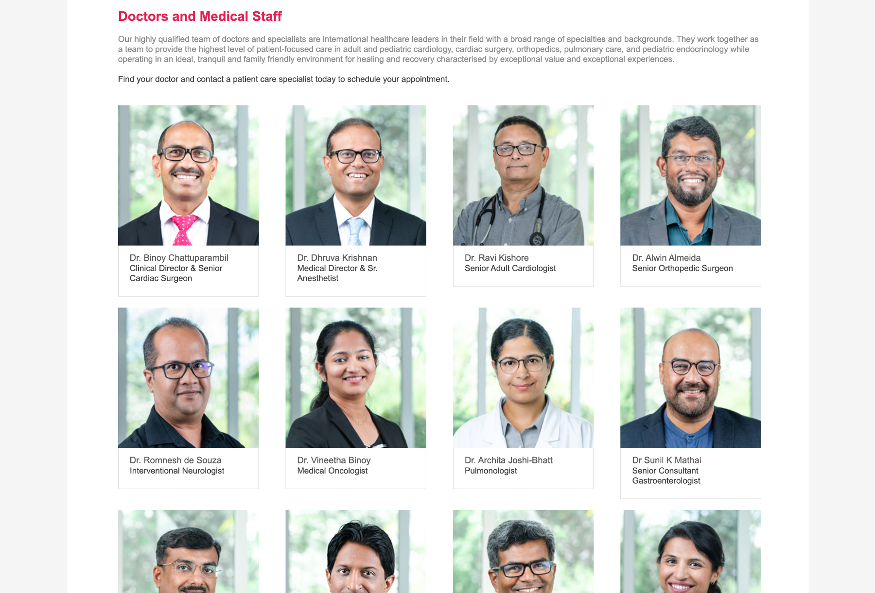
DOCTOR'S DIRECTORY
Incomplete flows
Dead ends on cards - no option for further clicks
Timings & availability details missing
Misorganized data lacking overall structure
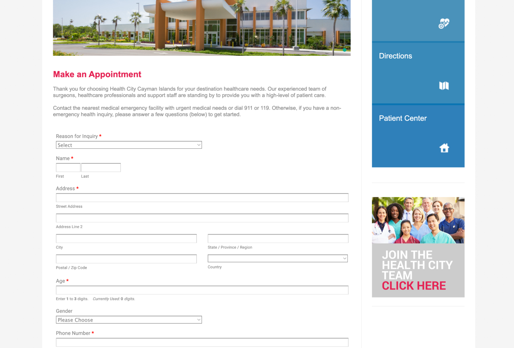
APPOINTMENT FORM
Overcomplicated
No link between the doctor & form
Irrelevant fields present
No instant feedback - increasing wait time
STEP 2 : ANALYSING PAIN POINTS